And Serve You French Toast (Data) Again 2: Quantities
23 May 2022


Here my goal is to do some light analysis and data viz of the ingredient quantities from the allrecipes.com french toast recipe data I gathered.
Normalizing the units
I would like to focus in on bread, eggs, and milk/cream. Obviously, there is variation in what units of measurements the recipes call for, so I tried my best to make the units as congruent as possible.
Start with opening the CSV data as a Pandas dataframe.
1
2
3
ft_recipes = pd.read_csv("french_toast_recipes_cleaned_final.csv", index_col=False, na_filter = False)
ft_recipes["quant"] = pd.to_numeric(ft_recipes["quant"])
ft_recipes_vc = ft_recipes["title"].value_counts()
First I tackled the bread. As you might expect, most of the recipes did not give explicit quantites of bread. Only a handful specify a 1 pound loaf of bread, and even fewer of those specific the width of slides. And that makes sense, bread comes in all shapes and sizes and it would be a bit silly if a recipe called for 450g of bread or whatever. And really, the exact bread quanity for this doesn’t matter too much. The way I figure it, you just need enough bread to soak up the custard, and that custard and the following cooking techniques are more important to the outcome. I just focused on recipes that called for “slices”.
1
2
3
4
## Normalizing the units
# bread
b = ft_recipes.loc[ft_recipes["category"] == "bread"].copy()
b.loc[b["units"] == "slices", ["bread slices"]] = b["quant"]
For eggs, I wanted one column for whole eggs and one for eggs in fluid ounces. For fluid ounces, I assumed each egg is equivalent to 1.7 fluid ounces (supposed equivalent of a large egg).
1
2
3
4
5
6
# eggs
e = ft_recipes.loc[ft_recipes["category"] == "eggs"].copy()
# wolframalpha: 1.7 fluid ounces from a large egg
e.loc[(e["ingr"] == "eggs") & (e["units"] != "cups"), ["eggs (fl oz)"]] = e["quant"] * 1.7
e.loc[e["units"] == "cups", ["eggs (fl oz)"]] = e["quant"] * 8
e["eggs (whole #)"] = e["eggs (fl oz)"] / 1.7
Milk is easy, just a conversion to fluid ounces.
1
2
3
4
5
# milk
m = ft_recipes.loc[ft_recipes["category"] == "milkcream"].copy()
m.loc[m["units"] == "cups", ["milk/cream (fl oz)"]] = m["quant"] * 8
m.loc[m["units"] == "tablespoons", ["milk/cream (fl oz)"]] = m["quant"] * 2
m.loc[m["units"] == "teaspoons", ["milk/cream (fl oz)"]] = m["quant"] * 0.1667
Finally, I group the rows into a “normalized” dataframe with a total of 86 recipes.
1
2
3
4
5
6
norm = pd.concat([b,e,m])
norm = norm[["title", "bread slices", "eggs (fl oz)", "milk/cream (fl oz)"]]
norm = norm.groupby("title", as_index=False).agg("first")

# check that each recipe has only one bread, egg, milk/cream
norm_cnt = norm.groupby("title", as_index=False).agg("count")
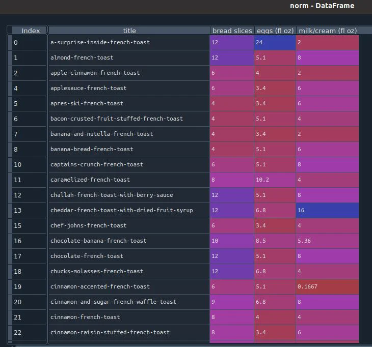 Dataframe of normalized units.
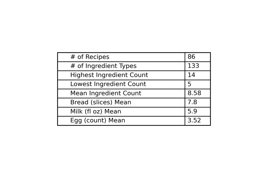
Basic Stats
A quick look at some basic stats of the recipes (and a demo of turning a dataframe into a table with matplotlib).
1
2
3
4
5
6
7
8
9
10
11
12
13
14
15
16
17
18
19
20
21
22
23
24
25
26
27
28
29
30
31
32
33
34
35
36
37
38
39
40
41
42
43
44
45
46
47
48
49
50
51
52
53
54
55
56
#############################################
# basic stats
#############################################
bread = ft_recipes.loc[ft_recipes["category"] == "bread"]
bread = bread.sort_values(by=['ingr'])
bread_vc = bread[["title", "category"]].value_counts()
bread_grp = bread.groupby(['title','category'])['ingr'].apply(' and '.join).reset_index()
bread_cnt = bread_grp["ingr"].value_counts().reset_index()

mlk = ft_recipes.loc[ft_recipes["category"] == "milkcream"]
mlk = mlk.sort_values(by=['ingr'])
mlk_vc = mlk[["title", "category"]].value_counts()
mlk_grp = mlk.groupby(['title','category'])['ingr'].apply(' and '.join).reset_index()
mlk_cnt = mlk_grp["ingr"].value_counts().reset_index()

egg = ft_recipes.loc[ft_recipes["category"] == "eggs"]
egg = egg.sort_values(by=['ingr'])
egg_vc = egg[["title", "category"]].value_counts()
egg_grp = egg.groupby(['title','category'])['ingr'].apply(' and '.join).reset_index()
egg_cnt = egg_grp["ingr"].value_counts().reset_index()

recipe_cnt = len(ft_recipes["title"].value_counts())
ingr_type_cnt = len(ft_recipes["ingr"].value_counts())
ingr_num_min = ft_recipes.groupby(['title'])['ingr'].count().min()
ingr_num_max = ft_recipes.groupby(['title'])['ingr'].count().max()
ingr_num_mean = np.round(ft_recipes.groupby(['title'])['ingr'].count().mean(),2)

bread_type_cnt = len(bread_cnt)
bread_slc_mean = np.round(norm["bread slices"].mean(),1)
milk_type_cnt = len(mlk_cnt)
milk_mean = np.round(norm["milk/cream (fl oz)"].mean(),1)
egg_type_cnt = len(egg_cnt)
egg_mean = np.round(norm["eggs (whole #)"].mean(),2)

df = pd.DataFrame()
df= df.append({'# of Recipes': str(recipe_cnt),
               '# of Ingredient Types': str(ingr_type_cnt),
               'Highest Ingredient Count' : str(ingr_num_max),
               'Lowest Ingredient Count': str(ingr_num_min),
               'Mean Ingredient Count': ingr_num_mean,
               'Bread (slices) Mean' : bread_slc_mean,
               'Milk (fl oz) Mean' : milk_mean,
               'Egg (count) Mean' : egg_mean
               },
              ignore_index=True)

df = df.T.reset_index()

fig, ax = plt.subplots()
# hide axes
fig.patch.set_visible(False)
ax.axis('off')
ax.axis('tight')
table = ax.table(cellText=df.values, loc='center', cellLoc='left', colWidths=[0.5,0.1])
fig.tight_layout()
plt.savefig('2_analysis/french-toast-basic-stats_tbl.webp', dpi=300)
Visualizing Ingredient Quantities
I can now visualize the “spread” of data for each of the core ingredients using histograms. Note though that this is not complete, e.g. the bread plot is only for recipes that called for X number of slices.
1
2
3
4
5
6
7
8
9
10
11
12
13
14
15
16
17
18
19
20
21
22
23
24
25
26
27
28
29
30
31
32
33
34
35
36
37
38
39
40
41
42
43
44
#############################################
# histograms for bread, egg, milk
#############################################
# colors
colors = plt.cm.get_cmap('tab20b', 20).colors
c1 = colors[0]
c2 = colors[5]
c3 = colors[9]
c4 = colors[2]

fig, axs = plt.subplots(3, 1,
                        figsize=(4,6), constrained_layout=True)
plt.rc('axes', labelsize=12)    # fontsize of the x and y labels
plt.rc('legend', fontsize=12)    # legend fontsize
plt.rc('figure', titlesize=12)  # fontsize of the figure title

ax = axs[0]
n_bins = 14
p1 = ax.hist(norm["bread slices"], bins=n_bins, facecolor=c1, edgecolor=c4, linewidth=0.5)
ax.set_ylim([0, 28])
ax.set_xlabel('Bread Slices')
m = norm["bread slices"].mean()
ax.axvline(m, label="mean", color = 'r', linestyle = 'dashed', linewidth = 2)
ax.legend()

ax = axs[1]
n_bins = 13
p1 = ax.hist(norm["eggs (whole #)"], bins=n_bins, facecolor=c2, edgecolor=c4, linewidth=0.5)
ax.set_ylim([0, 28])
ax.set_xticks(ticks=[1,3,5,7,9,11,13])
ax.set_xlabel('Eggs #')
ax.set_ylabel('# of French Toast Recipes')
m = norm["eggs (whole #)"].mean()
ax.axvline(m, label="mean", color = 'r', linestyle = 'dashed', linewidth = 2)

ax = axs[2]
n_bins = 16
p1 = ax.hist(norm["milk/cream (fl oz)"], bins=n_bins, facecolor=c3, edgecolor=c4, linewidth=0.5)
ax.set_ylim([0, 28])
ax.set_xlabel('Milk/cream (fl oz)')
m = norm["milk/cream (fl oz)"].mean()
ax.axvline(m, label="mean", color = 'r', linestyle = 'dashed', linewidth = 2)

plt.savefig('2_analysis/french-toast-hist-essn-ingr2.webp', dpi=300)
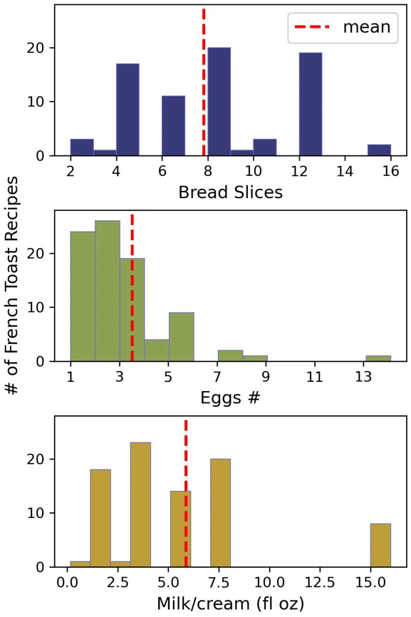 Histograms of essential ingredients.
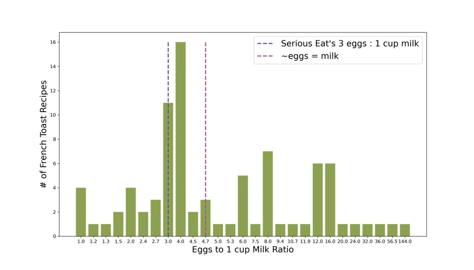
Egg to Milk Ratios
According to Serious Eats , an ideal ratio for the french toast custard is 3 eggs for every 1 cup of milk. Having tried this ratio myself, I can say it “seems alright to me”. Let’s see how these recipes line up with that.
Line to calculate the ratio:
1
2
norm["e2m ratio"] = norm["eggs (fl oz)"] / norm["milk/cream (fl oz)"]
e2m_vc = norm["e2m ratio"].value_counts()
And we can do a quick plot of the data.
1
2
3
4
5
6
plt.bar(e2m_vc.index, e2m_vc, width=0.25)
plt.xlabel('Egg-to-Milk Ratio')
plt.ylabel('# of French Toast Recipes')
plt.vlines(0.6375  , 0, 16, color="gray", linestyle='dashed', label="standard 3 eggs : 1 cup milk")
plt.legend()
plt.savefig('2_analysis/french-toast-egg2milk-ratio-bar1.webp', dpi=300)
 Initial bar chart of french toast recipe egg-to-milk ratios.
This gives us sense that there is a cluster around 3 or 4 eggs for every cup of milk. However, this graph could be better. Let’s start over (inside scoop into the learning process here).
1
2
3
4
5
6
7
8
9
10
11
12
13
14
15
16
17
18
19
20
21
22
23
24
25
26
27
28
29
30
31
32
# BAR CHART
# set-up data
norm["e2m ratio"] = norm["eggs (fl oz)"] / norm["milk/cream (fl oz)"]
norm["e2m ratio, # eggs to 1 cup milk"] = (norm["e2m ratio"] / 1.7) * 8
norm["e2m ratio, # eggs to 1 cup milk"] = norm["e2m ratio, # eggs to 1 cup milk"].round(decimals=1)
e2m_vc = norm["e2m ratio, # eggs to 1 cup milk"].value_counts().reset_index()
e2m_vc = e2m_vc.sort_values(by=['index'])
# figure, font size
plt.figure(figsize=(14,8))
plt.rc('axes', labelsize=18)    # fontsize of the x and y labels
plt.rc('legend', fontsize=18)    # legend fontsize
plt.rc('figure', titlesize=16)  # fontsize of the figure title
# colors
colors = plt.cm.get_cmap('tab20b', 20).colors
c1 = colors[5]
c2 = colors[1]
c3 = colors[17]
# data x and y axis
x = np.arange(0,len(e2m_vc["index"]))
y = e2m_vc["e2m ratio, # eggs to 1 cup milk"]
# x axis ticks
plt.xticks(ticks=x,labels=e2m_vc["index"])
plt.bar(x, y, color=c1)
# labels
plt.xlabel('Eggs to 1 cup Milk Ratio')
plt.ylabel('# of French Toast Recipes')
plt.vlines(7 , 0, 16, color=c2, linestyle='dashed', label="Serious Eat's 3 eggs : 1 cup milk", linewidth=2.25)
plt.vlines(10 , 0, 16, color=c3, linestyle='dashed', label="~eggs = milk", linewidth=2.25)
plt.legend()
# save as an image
plt.savefig('2_analysis/french-toast-egg2milk-ratio-bar2.webp', dpi=300)
plt.show()
 Bar chart of french toast recipe egg-to-milk ratios (looking better)
This plot more clearly shows the count for each ratio. And, look at that, it turns out that 4 eggs to 1 cup is seen more often among these recipes, as opposed to Serious Eats’ reccomendation. Who’s to say why this is.
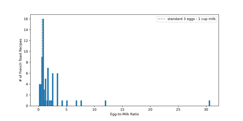
Of course, other recipes have much higher ratios. These are cases where a little bit of milk is called for, perhaps they were going for something for more savory / eggy. We can cut out some of these cases where little milk is used, and then try out a histogram.
1
2
3
4
5
6
7
8
9
10
11
12
13
14
15
16
# HIST
# set-up data
e2m_cut = norm[norm["e2m ratio, # eggs to 1 cup milk"] < 12]
# plot
plt.figure(figsize=(10,5))
plt.rc('axes', labelsize=12)    # fontsize of the x and y labels
plt.rc('legend', fontsize=12)    # legend fontsize
plt.rc('figure', titlesize=12)  # fontsize of the figure title
ax = plt.axes()
n_bins = 11
p1 = plt.hist(e2m_cut["e2m ratio, # eggs to 1 cup milk"], bins=n_bins, facecolor = c2, edgecolor=c4, linewidth=0.5)
ax.set_xticks(ticks=np.arange(0,12))
ax.set_ylim([0, 24])
plt.xlabel('Eggs to 1 cup Milk Ratio')
plt.ylabel('# of French Toast Recipes')
plt.savefig('2_analysis/french-toast-egg2milk-ratio-hist1.webp', dpi=300)
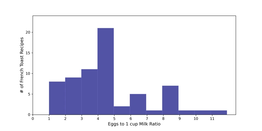 Histogram of egg-to-milk ratios (subset of data).
Nice.