And Serve You French Toast (Data) Again 3: Ingredients
23 May 2022
Here my goal is to visualize the variety and number of ingredients used among the allrecipes.com french toast recipe data I gathered.
Pie Charts
For the three “essential” ingredients, I wanted visualize all the unique variants. My first instinct was to do pie charts. However, in trying to make pie charts, I learned that (1) they are a pain to make and (2) they are also apperently not that great for data visualization either.
Even though I am now not a fan, I will still include them here due to sunk costs and all that.
I experimented with a few different pi chart styles.
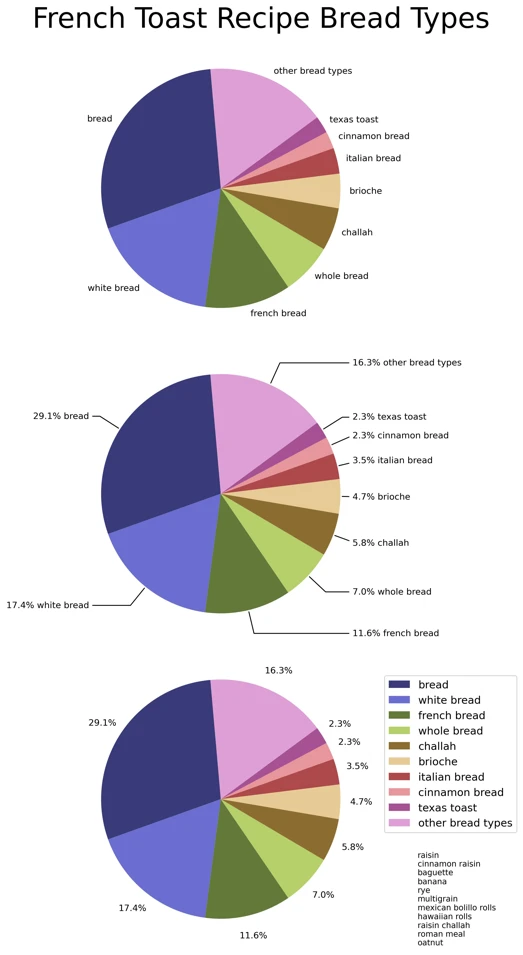
And I finally settled for style below. First, I’ll include portion of code:
1
2
3
4
5
6
7
8
9
10
11
12
13
14
15
16
17
18
19
20
21
22
23
24
25
26
27
28
29
30
31
32
33
34
35
36
37
38
39
40
41
42
43
44
45
46
47
48
49
50
51
52
53
54
55
56
57
58
59
ft_recipes = pd.read_csv("french_toast_recipes_cleaned_final.csv", index_col=False, na_filter = False)

###############################################################################
###############################################################################
# PI CHART DIFFERENT INGREDIENTS
###############################################################################
###############################################################################
fig, axs = plt.subplots(3, 1, figsize=(15, 15), subplot_kw=dict(aspect="equal"),
                        constrained_layout=True)
# adjust title position to not be slightly off center
mid = (fig.subplotpars.right + fig.subplotpars.left)/2 + 0.03
fig.suptitle("French Toast Recipes, Essential Ingredient Types", fontsize=32, x=mid)
#############################################
# Pie Chart Bread
#############################################
pie_ax = axs[0]
bread = ft_recipes.loc[ft_recipes["category"] == "bread"]
bread = bread.sort_values(by=['ingr'])
bread_vc = bread[["title", "category"]].value_counts()
bread_grp = bread.groupby(['title','category'])['ingr'].apply(' and '.join).reset_index()
bread_cnt = bread_grp["ingr"].value_counts().reset_index()
bread_prc = bread_grp["ingr"].value_counts(normalize=True)*100
m = 12
e = 24
# set up labels and legend labels
bread_prc = bread_prc.reset_index()
bread_prc_str = bread_prc["ingr"].map(lambda x: '{0:.1f}'.format(x))
bread_prc["labels"] = bread_prc_str + "% " + bread_prc["index"]
bread_prc["legend"] = bread_prc.loc[:, "labels"]
bread_maj = bread_prc[0:m]
bread_maj["legend"] = ""
bread_other = bread_prc[m:e]
bread_other["labels"]  = ""
bread_pchart = bread_maj.append(bread_other)
bread_pchart = bread_pchart.set_index("index")
# colors
c1 = plt.cm.get_cmap('tab20b', len(bread_maj["legend"]))
# c2 = plt.cm.get_cmap('Reds_r', len(bread_pchart["legend"]))
c3 = plt.cm.get_cmap('tab20', len(bread_other["legend"]))
colors = c1.colors
# colors2 = c2(np.linspace(0.2, 0.8, 13)) #.. and linspace for continuous ones
colors3 = c3.colors
newcolors = np.concatenate((colors[0:m], colors3[0:(e-m)]))
newcmp = mcolors.ListedColormap(newcolors)
# pie chart
pie_ax.pie(bread_pchart["ingr"], labels=bread_pchart["labels"],
            labeldistance=1.1, startangle=20,
            colors=newcolors,
            wedgeprops={'linewidth': 0.5, 'linestyle': 'solid',
                         'edgecolor' : 'black'})
# legend
wedges = pie_ax.patches
labels = list(bread_pchart["legend"])
wedges = wedges[m:e]
labels = labels[m:e]
pie_ax.legend(labels = labels[::-1], handles = wedges[::-1], bbox_to_anchor=(1.0, 0.85))

# ...
# (rest of code for other two charts here)
And then the charts themselves:
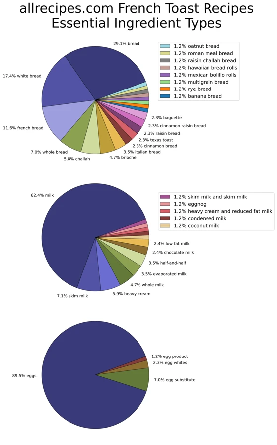
At least they are colorful.
Raise the Bar
Having rejecting pie charts, I went on to try bar charts.
Again, portion of code:
1
2
3
4
5
6
7
8
9
10
11
12
13
14
15
16
17
18
19
20
21
22
23
24
25
26
27
28
29
30
31
32
33
34
35
36
37
38
39
40
41
42
43
44
45
46
47
48
49
50
51
52
53
54
55
56
57
58
59
60
61
###############################################################################
###############################################################################
# BAR CHARTS
###############################################################################
###############################################################################

bread = ft_recipes.loc[ft_recipes["category"] == "bread"]
bread = bread.sort_values(by=['ingr'])
bread_vc = bread[["title", "category"]].value_counts()
bread_grp = bread.groupby(['title','category'])['ingr'].apply(' and '.join).reset_index()
bread_cnt = bread_grp["ingr"].value_counts().reset_index()
bsz = len(bread_cnt["ingr"])
# ft_multi_bread = ft_recipes[ft_recipes["title"].isin(list(multi_bread_titles))]

mlk = ft_recipes.loc[ft_recipes["category"] == "milkcream"]
mlk = mlk.sort_values(by=['ingr'])
mlk_vc = mlk[["title", "category"]].value_counts()
mlk_grp = mlk.groupby(['title','category'])['ingr'].apply(' and '.join).reset_index()
mlk_cnt = mlk_grp["ingr"].value_counts().reset_index()
msz = len(mlk_cnt["ingr"])

egg = ft_recipes.loc[ft_recipes["category"] == "eggs"]
egg = egg.sort_values(by=['ingr'])
egg_vc = egg[["title", "category"]].value_counts()
egg_grp = egg.groupby(['title','category'])['ingr'].apply(' and '.join).reset_index()
egg_cnt = egg_grp["ingr"].value_counts().reset_index()
esz = len(egg_cnt["ingr"])

fig, axs = plt.subplots(3, 1, gridspec_kw={'height_ratios': [bsz, msz, esz]},
                        figsize=(10,14), constrained_layout=True)

# adjust title position to not be slightly off center
mid = (fig.subplotpars.right + fig.subplotpars.left)/2
fig.suptitle("allrecipes.com French Toast Recipes \n Essential Ingredient Types", fontsize=18, x=mid)

# colors
colors = plt.cm.get_cmap('tab20b', 20).colors
c1 = colors[0]
c2 = colors[5]
c3 = colors[9]

N = 23
y_pos = np.linspace(1,N*3.0,N)
xmax=100
#############################################
# bread
#############################################
ax = axs[0]
ax.set_xlim([0,xmax])
ax.margins(0.015)
y = y_pos[0:len(bread_cnt["ingr"])]
p1 = ax.barh(y, bread_cnt["ingr"][::-1], tick_label=bread_cnt["index"][::-1],
                 height=2.5,  color=c1)
# ticks
ax.set_xticks(ticks=[])
ax.tick_params(bottom=False, left=False)
# bar label
ax.bar_label(p1, label_type='edge', padding=8)
# remove border
for s in ax.spines:
    ax.spines[s].set_visible(False)
And the plot output:
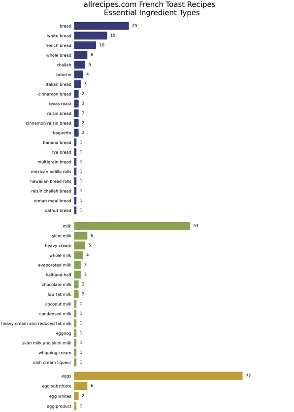
Overall, this seems good.
Other Ingredients
Can also do a bar chart for “non-essential” ingredients (with slightly improved code):
1
2
3
4
5
6
7
8
9
10
11
12
13
14
15
16
17
18
19
20
21
22
23
24
25
26
27
28
29
30
31
32
33
34
35
36
37
38
39
40
41
42
43
44
45
46
47
48
49
50
51
52
53
54
ft_recipes = pd.read_csv("french_toast_recipes_cleaned_final.csv", index_col=False, na_filter = False)
###############################################################################
###############################################################################
# BAR CHARTS, VERTICAL
###############################################################################
###############################################################################

#############################################
# other
#############################################
crit = ((ft_recipes["category"] != "eggs") & (ft_recipes["category"] != "bread")
        & (ft_recipes["category"] != "milkcream"))
other = ft_recipes.loc[crit]


ocats = ["flavor", "sugar", "syrup", "fruit", "spread", "dairy", "nut", "cereal"]
ocats_cnt = []
hratios = []
for c, i in zip(ocats, range(len(ocats))):
    cat = other.loc[other["category"] == c]
    cat_cnt = cat["ingr"].value_counts().reset_index()
    ocats_cnt.append(cat_cnt)
    hratios.append(len(cat_cnt["ingr"]))


fig, axs = plt.subplots(len(ocats), 1, gridspec_kw={'height_ratios': hratios},
                        figsize=(9,20), constrained_layout=True)
mid = (fig.subplotpars.right + fig.subplotpars.left)/2
fig.suptitle("allrecipes.com French Toast Recipes \n 'Other' Ingredient Counts", fontsize=18, x=mid)
# colors
colors = plt.cm.get_cmap('tab20b', 40).colors

N = max([len(i) for i in ocats_cnt])
y_pos = np.linspace(1,N*3.0,N)
xmax=70

for occ, i in zip(ocats_cnt, range(len(ocats_cnt))):
    ax = axs[i]
    ax.set_xlim([0,xmax])
    ax.margins(0.015)
    y = y_pos[0:len(occ["ingr"])]
    x = occ["ingr"][::-1]
    p1 = ax.barh(y, x,
               tick_label=occ["index"][::-1], height=2.5, color=colors[i+i*3])
    # ticks
    ax.set_xticks(ticks=[])
    ax.tick_params(bottom=False, left=False)
    # bar label
    ax.bar_label(p1, label_type='edge', padding=8)
    # remove border
    for s in ax.spines:
        ax.spines[s].set_visible(False)

plt.savefig('2_analysis/french_toast_bar_plot_other.webp', dpi=300)
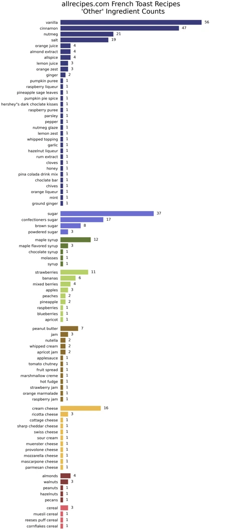 Categories: flavor, sugar, syrup, fruit, spread, dairy, nuts, and cereal.